yashica-mat-124g
📷 First impressions: Harman Phoenix (I) in medium format
Okay, I’ll admit it straight away: I’m quite late to the game. However, I just tried Harman Phoenix (I) in medium format and it impressed me so much that I have to write about it. Since Harman recently released the second iteration of Phoenix, some retailers are offering Phoenix I at a reduced price. I ordered two rolls and shot one straight away.
Many people on the internets say that the film itself already has a high contrast. So I thought it would be a good idea to use a lens that produces low-contrast images with color film. In my case, that’s the Yashica Mat 124 G TLR. In addition, the weather in my region has been very rainy this summer, with many days of heavy cloud cover, so the dynamic range of natural light is also limited—an ideal environment for a high-contrast film with a low dynamic range.
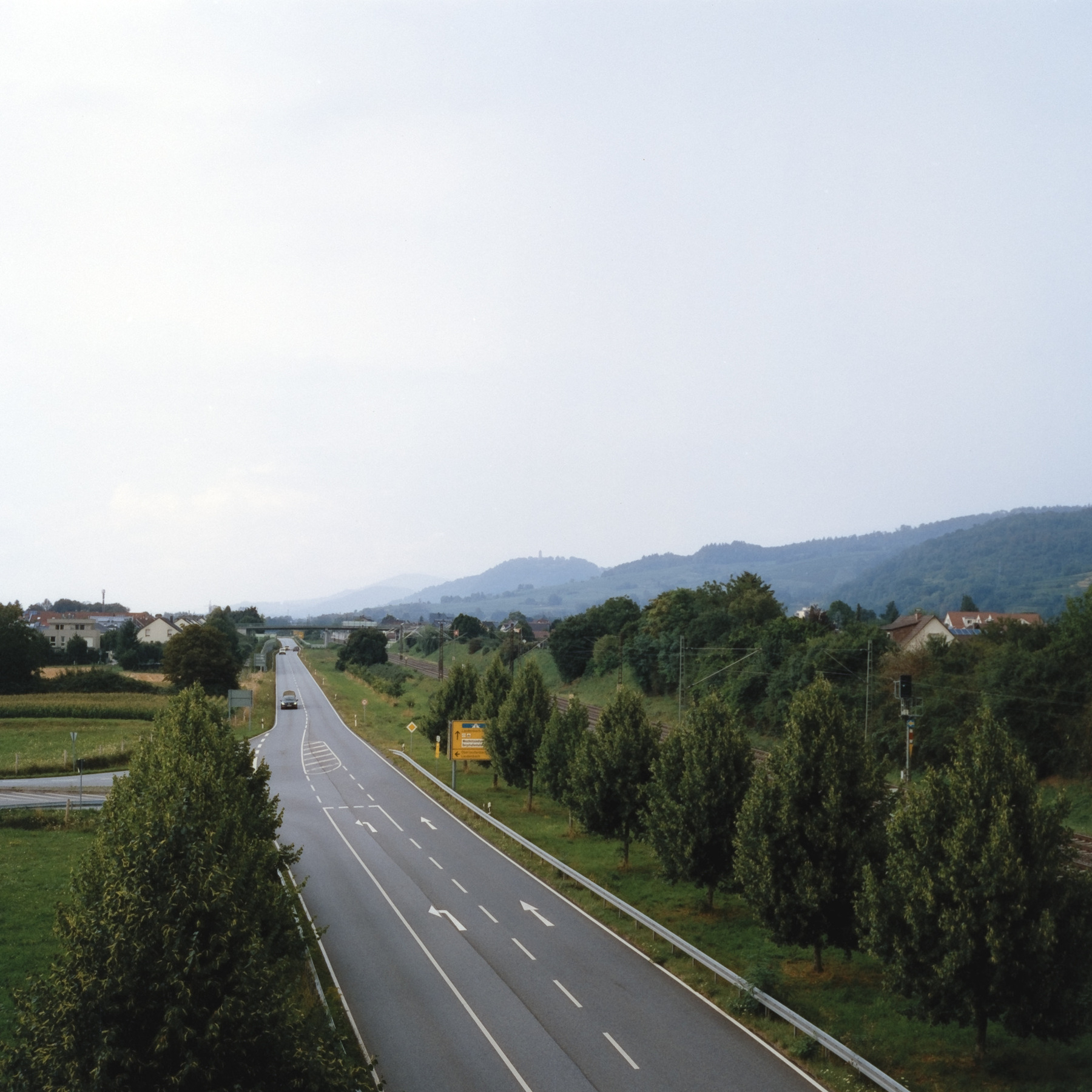
In fact, the dynamic range of the film is unimpressive. As you can see here, it is difficult to make out anything in the shadows, while the sky is already turning white in places. It was a bit foggy, which is what prompted me to take the shot in the first place, but I would have liked a little more dynamic range.
The film really doesn’t like underexposure. However, in my opinion, it produces very beautiful green and brown tones. As you can see on this other foggy day.
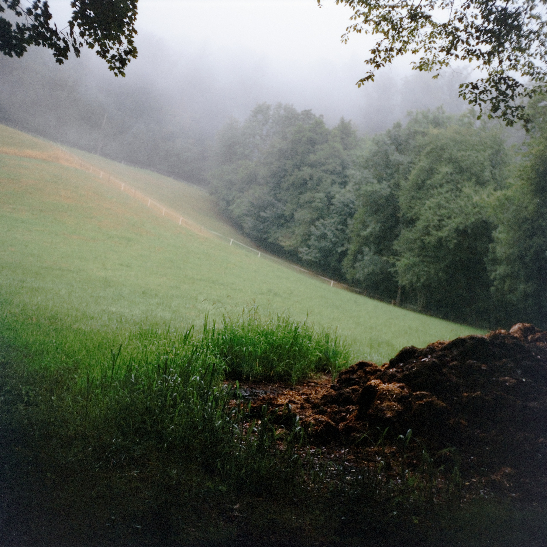
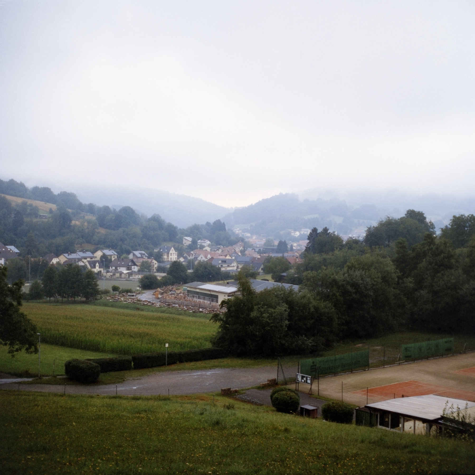
The colours and strong contrasts allow you to obtain very vivid colours even in hazy weather, without them looking too washed out. I have had poor experiences with Kodak films in these conditions and prefer black-and-white film in such situations. Phoenix seems to handle this well, though, due to its strong inherent contrast.
It is precisely these contrasts, combined with the rich green and brown tones, that can make simple forest scenes in rather modest light appear surprisingly rich and colourful.
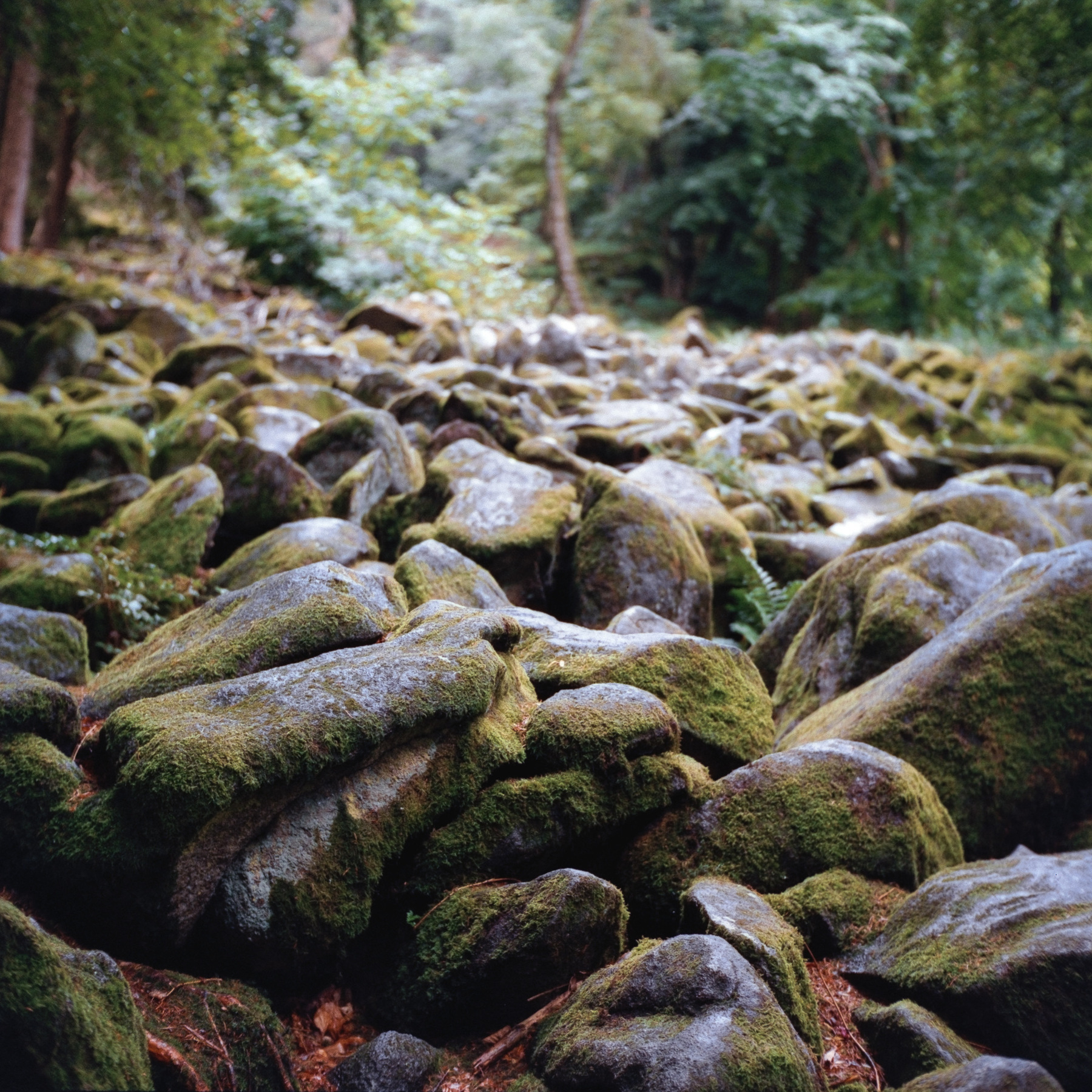
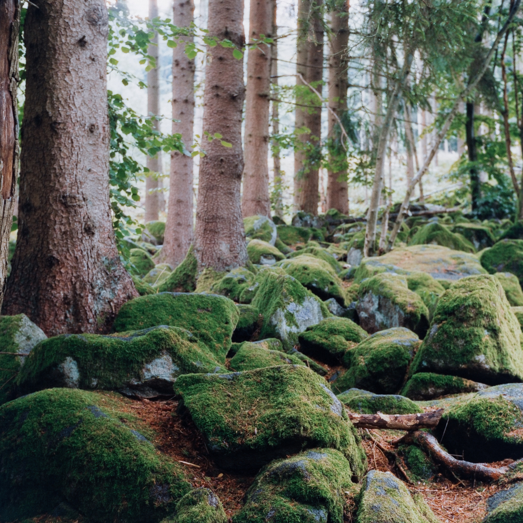
Of course, these very characteristics can be problematic in other situations. The range within which the film can be used effectively is therefore limited. It is undoubtedly not as flexible as Kodak Portra, the film world’s current “gold standard” . Nevertheless, the film’s unique qualities are remarkable and make it a wonderful stylistic tool.
Harman Phoenix really impressed me. The film is perfectly usable, albeit with consideration for the lighting and subject, and I’m excited about the second iteration, of which I already have some rolls. I’ll continue to use the first iteration, too, as it’s relatively inexpensive for me to get and I just like the look.
📷 Failures and thinking about square photography
A few days ago I tried something new and failed miserably. This happens to me a lot in film photography and somehow I like it. Making mistakes and learning from them seems to be an important aspect of photography to me, even more so in film photography than in digital photography. One of the reasons I started this blog was to reflect on this fact.
Especially in film photography I like to try new things and see how they work or analyse how and why I failed. So I’d like to do a little series of film photography mistakes I’ve made over the last two years. The first part will be this little snapshot from my bathroom, showing two rolls of freshly developed medium format film:
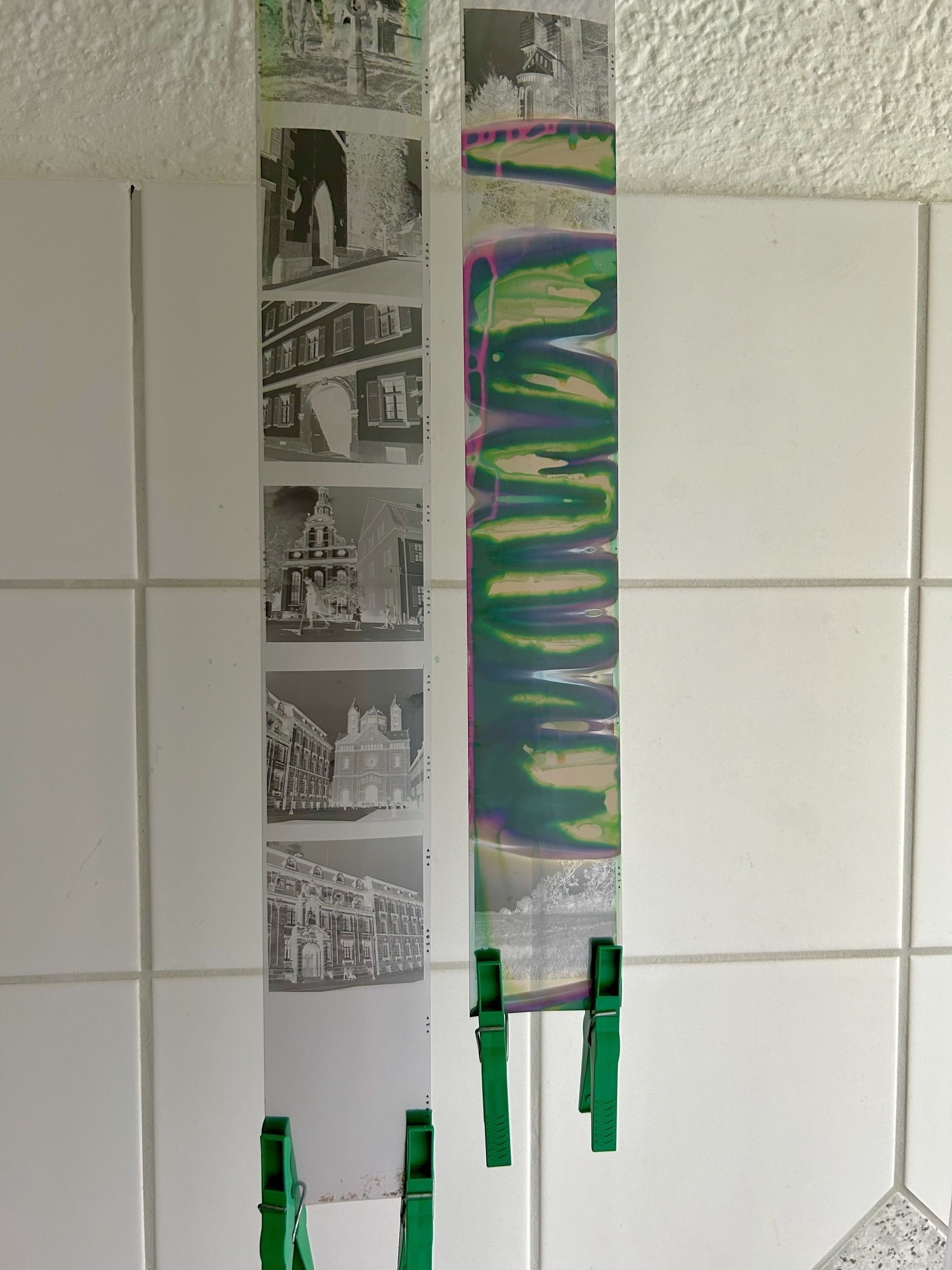
I used a JOBO 1520 development tank about which I can say that it is a nice product, built to a high standard. You can feel it immediately when you take it up. Furthermore, it allows you for a special trick: You can spool two rolls of medium format film on one of the reels and by doing so develop two medium format rolls at the same time using this little tank. You’ll need to press down a small “nub” into the reel when you spooled one roll onto the reel. This is supposed to stop the second roll from slipping over the first roll already on the spool.
Well, this is how it is supposed to work. On my first try, two frames overlapped by a centimetre. I thought that wasn’t too bad and that if I was careful it would work even better the second time. As you can see above, it didn’t work at all. Apparently I slipped six frames on the first roll. So six frames were lost on each roll during development.
I was annoyed, but not too sad. In the end, this mistake made me think more about my feelings about the lost frames than I would have otherwise: I struggle a lot with square format photography and I am not sure that a TLR like the Yashica Mat 124 G used for these frames is a camera I really like and enjoy using.
The Yashica has its qualities where it shines, it’s relatively light and, thanks to its leaf shutter, almost completely silent. The build quality is mostly okay, it won’t fall apart and most of the important parts are sturdy enough to work reliably. However, mine shows some rust where the paint has been applied unevenly, and the plastic parts feel and look cheap, making some parts like the shutter lock and film transport feel a little too delicate. The lens can produce contrasty and nice tonalities, especially in black and white, but colour film tends to look a little washed out. Ultimately, this is an uncoated and rather basic lens that is terribly susceptible to flare, renders very softly and shows quite a lot of vignetting wide open. All in all, it’s a mixed bag of a camera in my eyes.
Also, the Fomapan 100 film has disappointed me a few times now due to quality issues and a relatively low dynamic range. Some of my earlier Foma 120 rolls and the surviving frames from the last rolls showed white spots and/or flecks, especially in the highlights. I tried pre-washing the rolls extensively in development and this reduced the problem, but even after going through half a dozen 120 rolls I could not get rid of it completely. I’ve never seen anything like it before, not on any other manufacturer’s rolls, not even Foma’s 35mm rolls. Even a 120 roll of Fomapan 400 that I’ve since developed doesn’t show these problems. It could be that the emulsion is too soft for the Yashica’s film transport or there are quality control problems with Foma’s medium format products. If I knew it was expired I wouldn’t mind, but I’d like to be able to rely on fresh film at least.
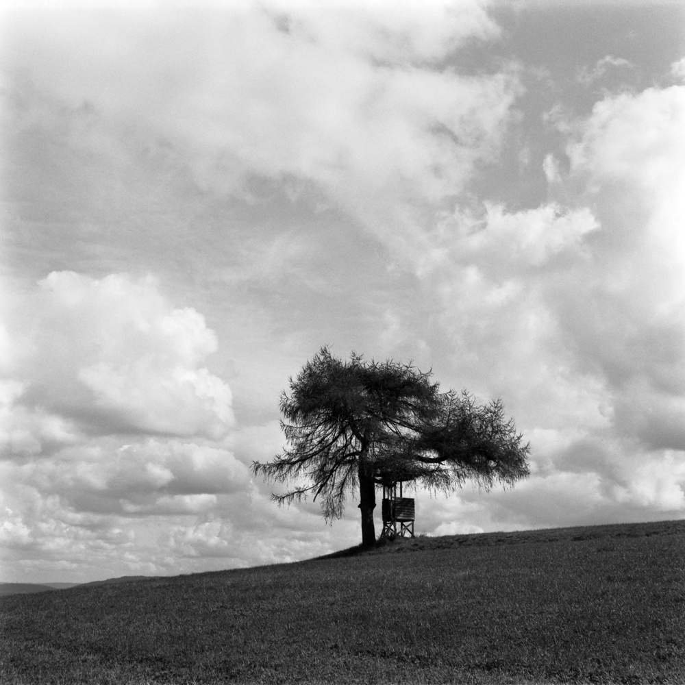
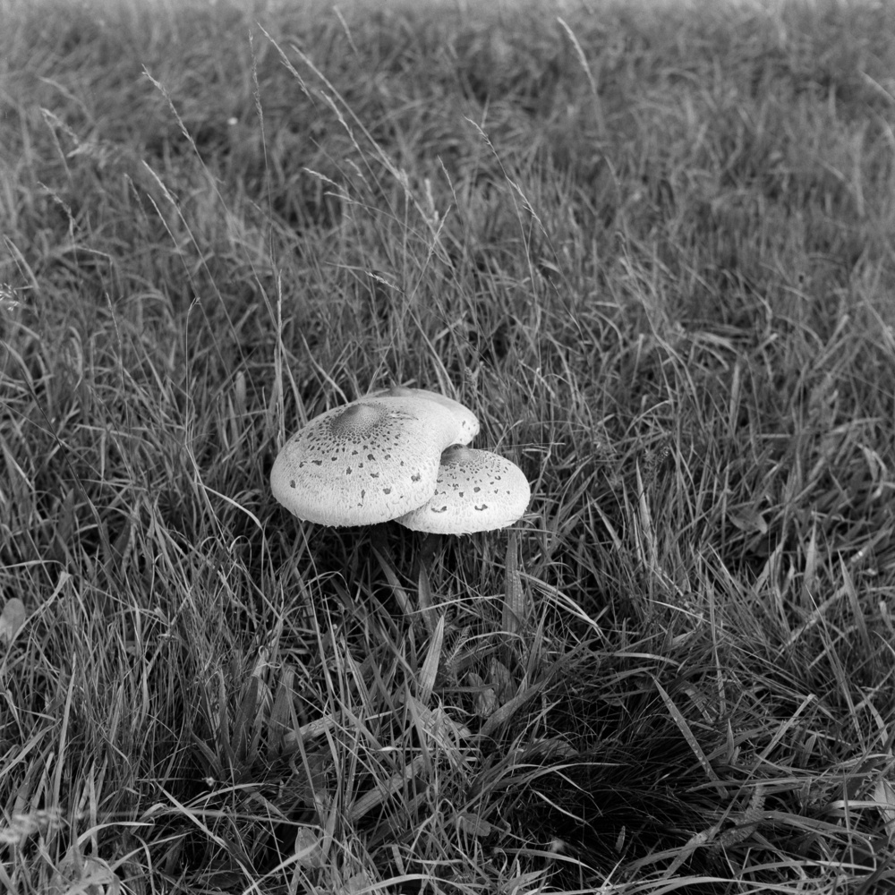
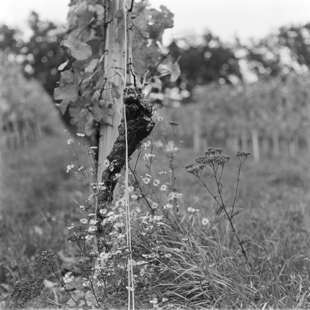
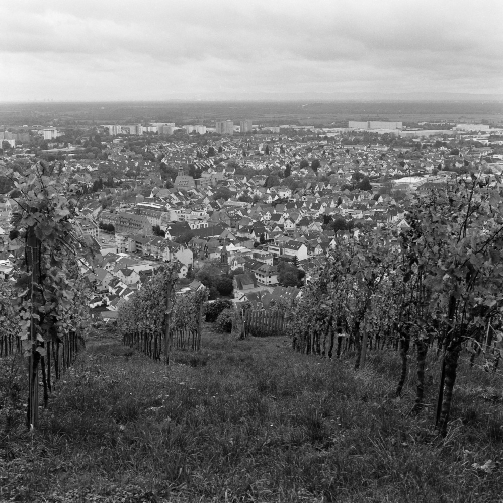
However, the biggest point for me is square photography in general. I currently have about 120 shots from the Yashica Mat 124 G in my Lightroom library (mostly black and white, only one roll in colour) and I still cannot decide if I like the square format. As is so often the case in photography, simpler compositions make for stronger images and I feel that this is even more true in square format. Also, square images benefit from, or even depend on, symmetry or at least some kind of visual balance in the frame: dark versus light, big versus small, crowded versus plain, and so on. I find it hard to see simple enough scenarios that show this kind of symmetry when I am out and about.
Would I have thought as much about this process, the issues involved, and myself and my feelings about photography if I hadn’t made that mistake at the beginning? Probably not, and that’s why I’ll keep trying new things, exploring, and probably failing from time to time.
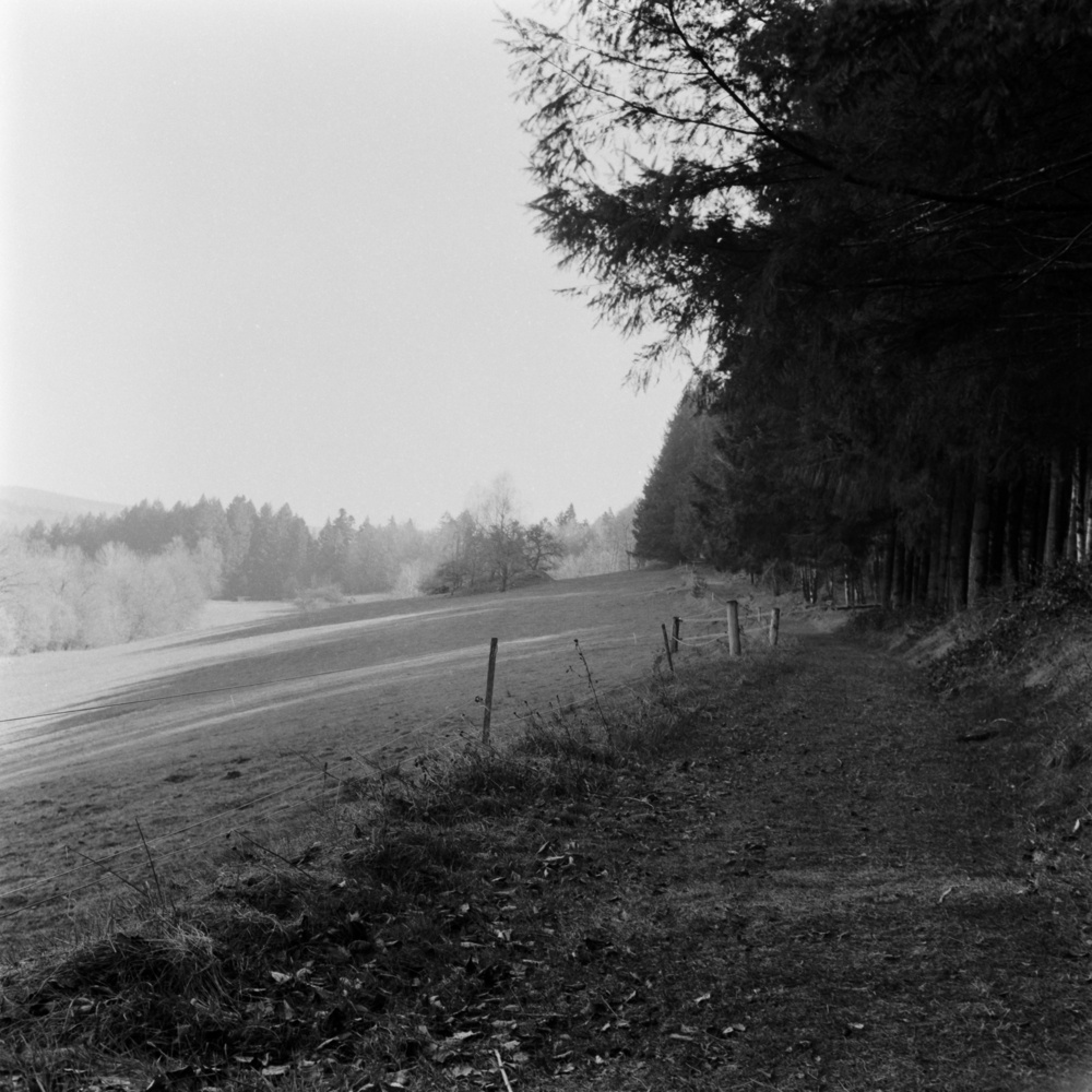
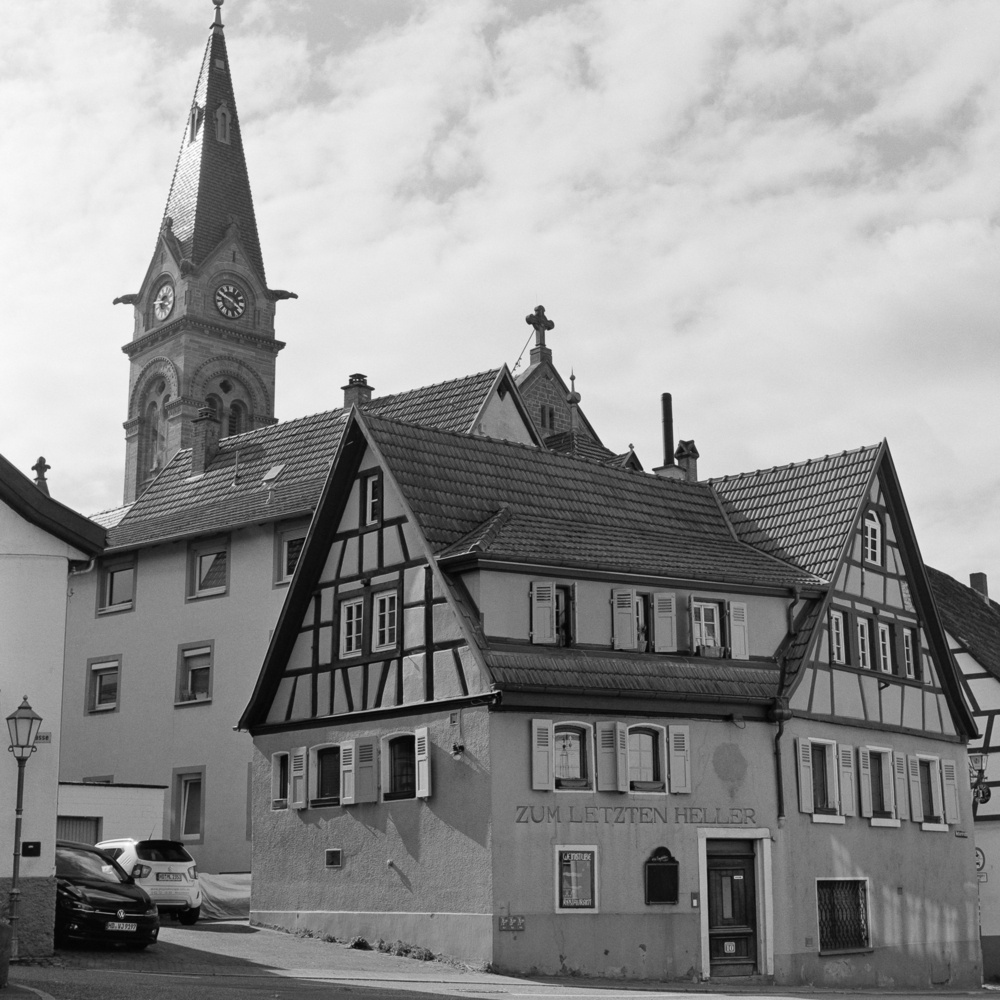
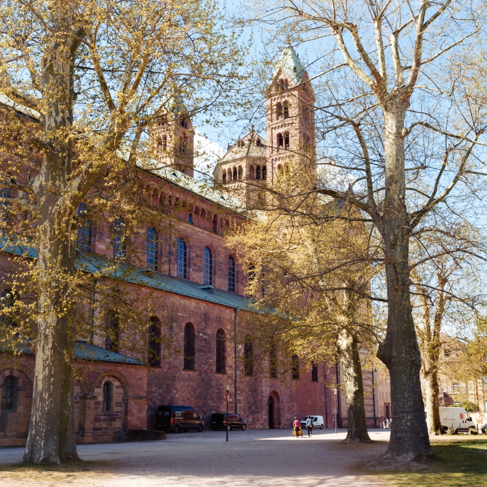
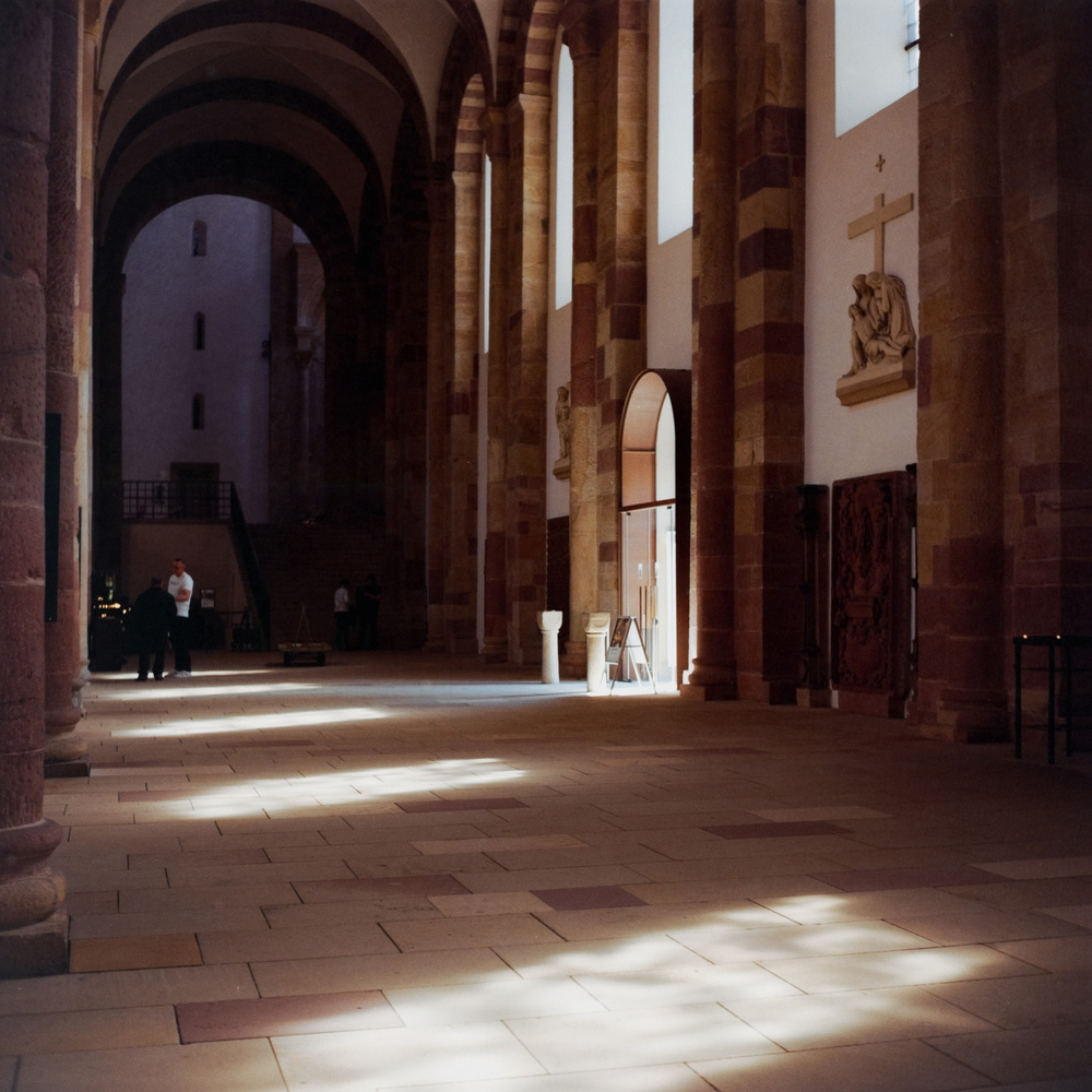
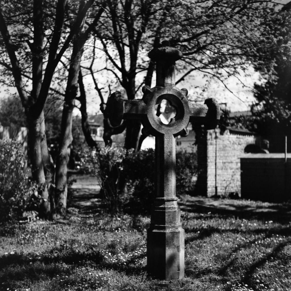
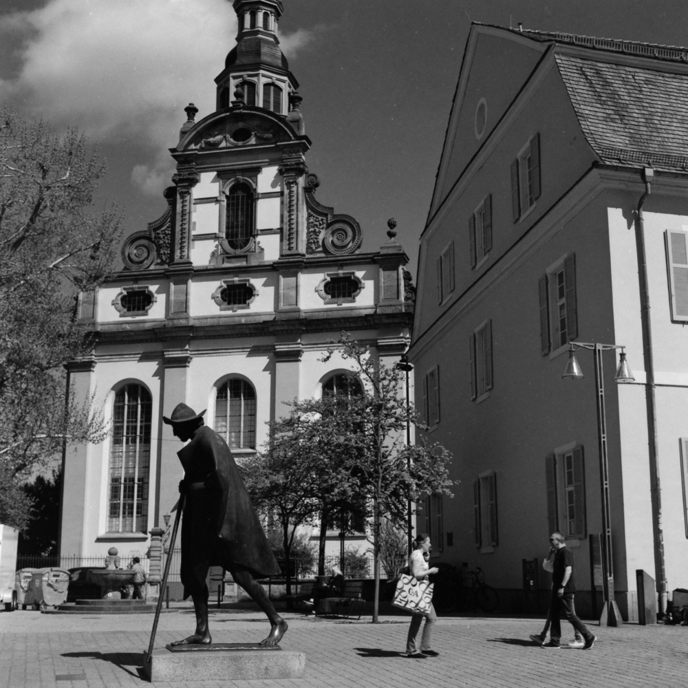
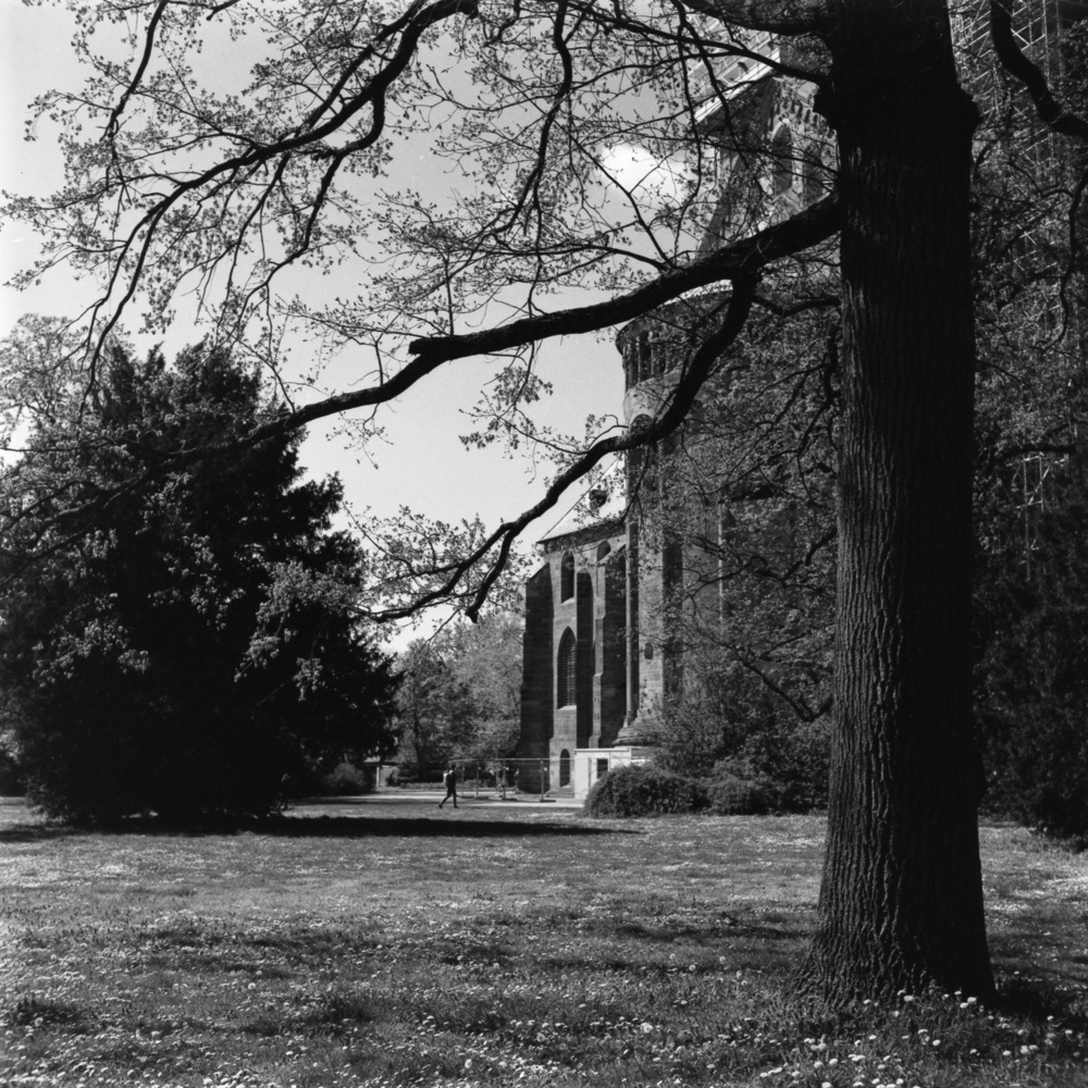
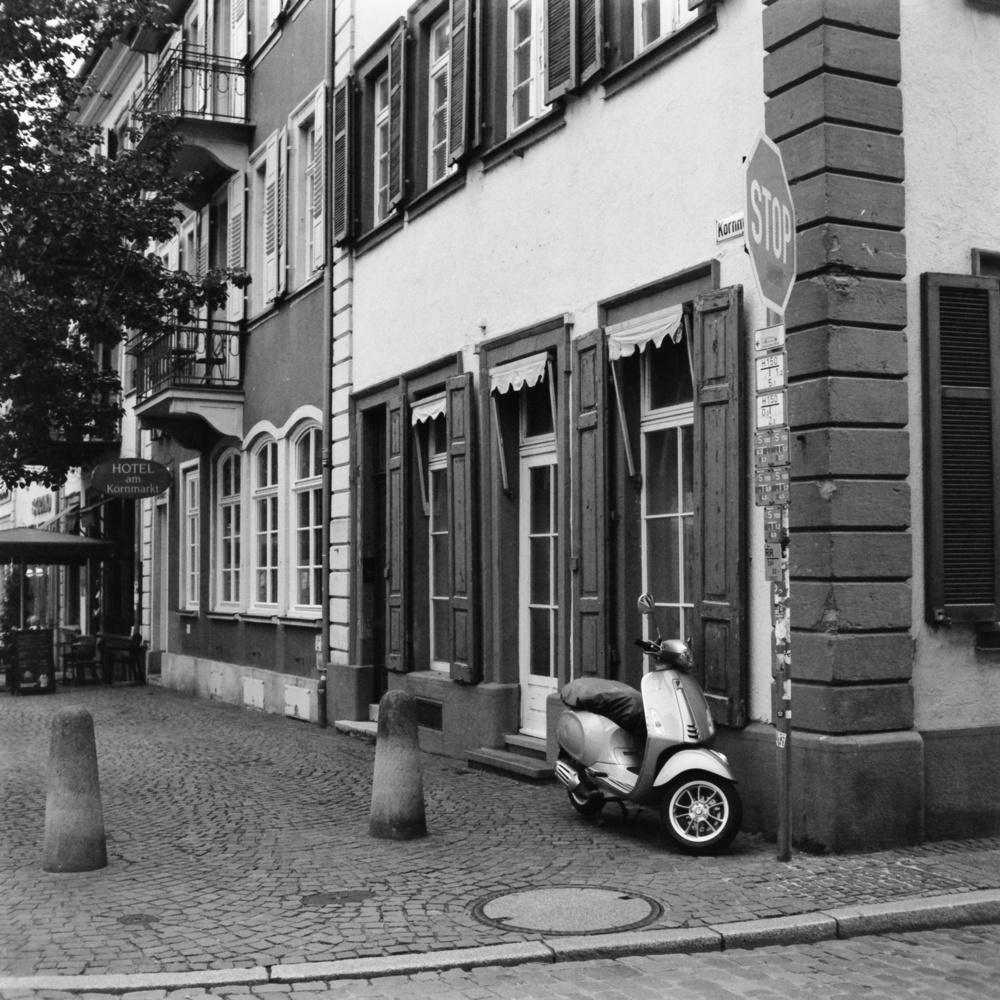
For what it’s worth, I’ll add some pictures I’ve taken with the Yashica over the last few months that I like. The films used were Ilford FP4+ (1, 2), Fomapan 100 (3, 4, 5, 9, 10, 11, 12), Ilford HP5+ (6), Kodak Gold 200 (7, 8) and Fomapan 400 (12). Except for the FP4+ and Kodak Gold, I did all the developing myself. I do the scans using a Fujifilm X-T 30 II and a Minolta MD 50mm Macro lens. All shots were taken within a 40km radius of my home town.
